
 Model Answer: Bar chart about fast food restaurants
Bar charts are quite common in IELTS writing task 1 academic. Many people panic when they see them but they get easier the more you practice. The most important thing here is that the report should be concise, so you must be selective. This means that you should never write about every single detail in the chart. Aim for around 170 to 190 words.
Long reports over 200 words are not necessary and could lead to more mistakes. If you can paraphrase the statistics using fractions then that can help with your vocabulary score. There’s more about this at the end of this lesson.
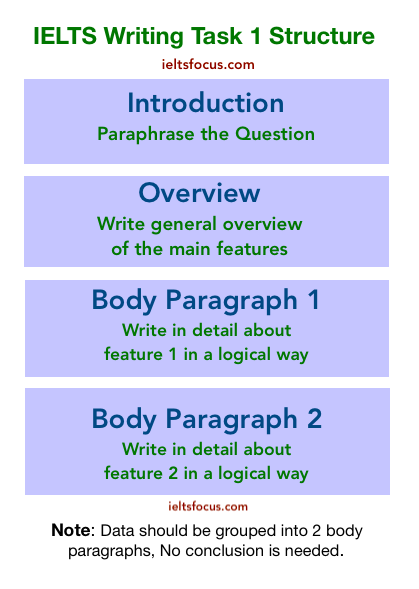
Pick out the key features and cover those. The introduction just simply rephrases the task question, the Overview should never contain numbers or data. Just summarise the key features. Write logically without any opinion and no conclusion is needed. Make sure you have clear paragraphs too, skip a line between them.
Structure
The Task
This task is from Cambridge IELTS 12, use only authentic Cambridge materials when practicing. You can find these practice books on Amazon.com

Model answer
Vocabulary and Grammar
Click here for a lesson on the language of trends and how to use prepositions.
When writing about figures you can use: ‘accounted for / comprised of / this figure increased… / the figure for..’
‘The number of ..’ is used with countable nouns:
The number of people / cars / houses / pets / books …. and so on.
‘The amount of …’ is used with uncountable nouns:
The amount of water / rice / coffee / tea / rain ..etc
Click here for a lesson on useful vocabulary in writing task 1
Paraphrasing the introduction
In the task question, it states: ‘The chart below shows…’ this can be written as ‘The chart illustrates…’ do not paraphrase the word ‘chart’ or ‘graph’ and remember that not everything has to be paraphrased when writing the introduction, yes you can keep some words, trying to change every single word adds to your stress and may lose you marks.
‘The chart illustrates how often people in the USA went to fast food establishments from 2003 to 2013.’
The Overview
Start the overview with ‘Overall’ then pick out the key features and write about those:
‘Overall, people who ate in fast food restaurants once a week and once or twice a month accounted for the highest percentages, whereas people who either never ate in these restaurants or went every day, showed the lowest percentages throughout the whole period.’
In the model answer, I put the overview in the same paragraph as the introduction. This is because the introduction was very short. You can sometimes do this if you have a short introduction.
There are no percentages in the overview and no details are needed. I have used the phrase: ‘throughout the whole period’ to show the time frame. I used superlatives to show the main features: The highest percentages / the lowest percentages.
Notice the conjunction ‘whereas’ to show contrast between the two. Punctuation is important also as the examiner will be looking at how it is used.
Grouping the information
It is important to write in a logical way in IELTS academic writing task 1. Grouping the information helps the examiner follow your points easily and helps your overall coherence and task response score. Be selective here and do not write about every single piece of information, keep it concise.

Main body one:
In 2003 the number of individuals who ate in fast food establishments once a week and once or twice a month accounted for 31% and 30% respectively. For those in the once a week group this figure increased slightly but then dropped to around 27% in 2013. The once or twice a month category declined to 25% then rose to approximately 33% by 2013.
Main body two:
Conversely, the figure for people who either ate at fast-food eateries every day or never, stood at under 5% throughout the ten year period. The several times a week category accounted for 17% in 2003, rose in 2006, settling back to around 16% in 2013. The few times a year group rose slightly then levelled off at 15% from 2006 to 2013.
- Notice that I have mentioned all the categories here, For a good task response score you have to cover the whole task but at the same time not go overboard with detail. Keep the word count below 200 words.
Paraphrasing statistics and fractions
There are other ways to write about statistics such as using fractions or the language of approximation. This will help your vocabulary score if you can vary the way you report on the numbers.